
Research has shown that color plays an integral part in defining a space. It also determines its mood and focal points and is also an expression of your creativity. As such, an in-depth exploration of color psychology and color unearths why particular colors are ideal for specific spaces.
The Intricacies of Color and Interior Design
The tapestry and exploration of color psychology introduces us to a new term, hues, referring to the dominance of the origin of colors. Hues play the primary role in evoking a specific mood. Meanwhile, these are the aspects that influence the hues of a color:
- ·Saturation
- ·Tone
- ·Tint
- ·Shade
- ·Value
After years of study of chromatics even from the top essay writing service providers, we learn that color psychology deciphers how the brain interprets wavelengths, considering the differing magnitudes in wavelengths evoked by different colors. The theory transcends interior design, our core focus today.
Mood
In exploring the wheel of color and their associated moods, it is safer to approach it from the basis of color, primary colors, to the most complex colors. While doing so, we shall give a few insights from an interior designer’s perspective.
Red
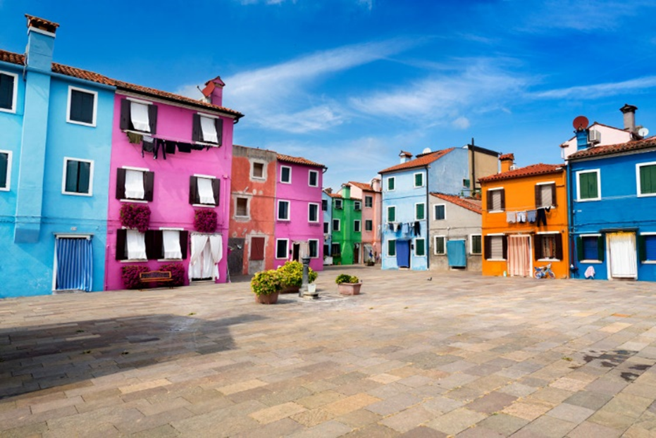
To set the record straight, red denotes vitality, warmth, enthusiasm, and energy in interior design. It can also infuse a space with life. However, in tiny settings, its intensity becomes overpowering. Therefore, using it as an accent color or combining it with soothing hues is advisable to prevent bringing disorder into the room.
The color red is associated with fierceness and carries so much depth. Therefore, using the right accent color for furniture or textiles is necessary. Furthermore, it works best in large rooms.
Blue
Unlike the other primary colors, blue is associated with coolness, and lighter shades denote calmness. It is the ideal go-to color if you intend to radiate peace in your home.
Yellow
Anyone can confirm that yellow radiates optimism, cheerfulness, and happiness. People associate it with sunshine, and it is no coincidence that it works perfectly for rooms that do not receive enough sunshine. However, going ham on the bright shades of this color can cause agitation; hence, you must move with moderation.
Now, it is time to build our pyramid by introducing secondary colors. The hues in secondary colors are a product of mixing any of the three primary colors. Here are the emotions they birth:
Green
The color green is a product of mixing blue and yellow. Most people associate it with nature. It also evokes rejuvenation and security.
Purple
The hues in purple are obtained by mixing toned-down and warm colors. It denotes luxury, tranquility, mystery, and stimulation. Lighter shades lean towards nostalgia and romance, while deeper shades create a reflective mood.
Orange
The hues in orange are associated with boldness and creativity. The warmth this color radiates is the kind that energizes, primarily since it is obtained by mixing the boldest and most cheerful primary colors. The vibrancy in orange makes it ideal for centerpieces.
The Merge Between Psychology and Mood
To slightly veer off from colors, any conversation about mood diversity invites a new term: noncolors. The primary noncolors in question are white and black. They evoke a different mood when used independently or alongside other colors.
White
The color white is often associated with cleanliness. It also evokes purity. In interior design, white is ideal for ceilings.
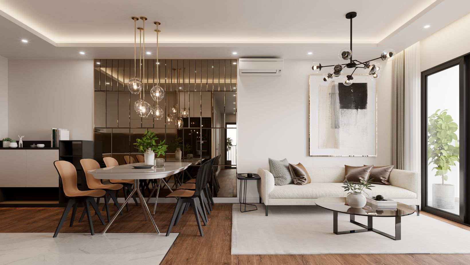
It is also known to open up spaces and create the illusion that they are larger than they are.
Black
The color black is stark, although it is associated with power, sophistication, and elegance. Incorporating black calls for minimalism. Merging it with another color brings out a classic vibe. It is vital to note that going ham on black evokes a gloomy mood.
Color in Interior Design
It is important to note that color psychology, also known as chromatics, researches the enervation effect of different colors matched with furnishings on design. It covers the effects of color that, if modified, are particular moods and emotions. The color blue, for example, can mean love, anger, or warmth at once.
So, before you create your color pallet, consider seeking the help of an interior designer with a good reputation online, similar to reading essayusa reviews from the best service providers. Meanwhile, here is a chance to highlight how some hues define a room and determine what emotion or mood it causes.
1. Tint
In colors, tint refers to a slight or pale coloration. Consider adding white to a basic hue; the outcome is a tint. The closer the color is to white, the less tint it has; hence, the pastel name. Pastel colors work best for kids’ bedrooms because of their calmness.
2. Shade
Contrarily, shade is what you obtain by adding black to a color. In interior design, dark shades are often paired with lighter, neutral colors to create balance.
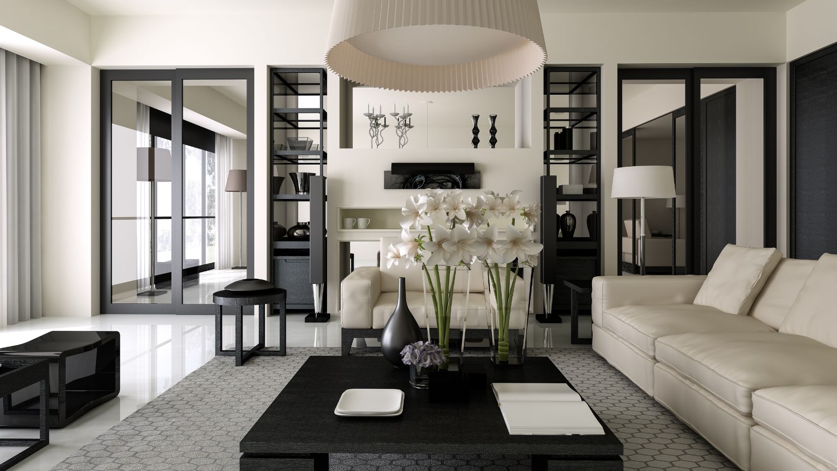
Doing so also prevents the dark hue from being too overpowering.
3. Tone
Imagine gray and the effect it has on color. It causes a reduction in the vibrancy of the color. If you are working with overbearingly vibrant colors, altering its tone alters the mood you intend to evoke.
4. Value
Imagine the intensity of light in a color; that is its value. Value invites us to peruse the color spectrum, and this theory explains why black is associated with overbearing moodiness and sadness.
5. Chroma
Regarding color, chroma is any color’s strength. For instance, when you hear conversations about the true blue or the true red, the disparity in the depth of the color is its chroma.
6. Saturation
In the simplest terms, saturation refers to how rich the color is—colors with a deep saturation level come across as bold compared to pastel colors, which exude warmth.
This surface-level exploration of color psychology in interior design explains how the choice of color affects the cohesiveness of a project. The details also hint at what you should consider, especially if you are specific about channeling a particular mood.
More Stories
5 Easy Steps to Save for an Investment Property Down Payment
5 Signs You Need a New Roof
Hire the Finest Landscaping Expert With These Tips