
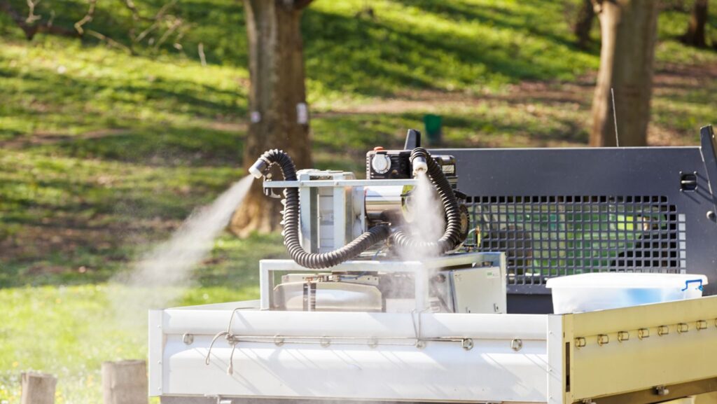
Powder coating is the somewhat special durable finish for many home projects-from refreshing patio furniture through updating railings to custom automotive parts and splash colors on metal décor. Compared to their liquid cousins, powder coating offers better protection against chips, scratches, fading, and corrosion and hence should be regarded most highly for any item that is subject to use or exposure to the outdoors. That said, the choice of powder coat color will greatly determine the life span and attractiveness of your project. And with a nearly endless array of shades and finishes out there, the color selection can be downright intimidating. There are some tips to help you choose color powders whether you are a DIYer with your trusty Graco spray machines in Canada or a professional.
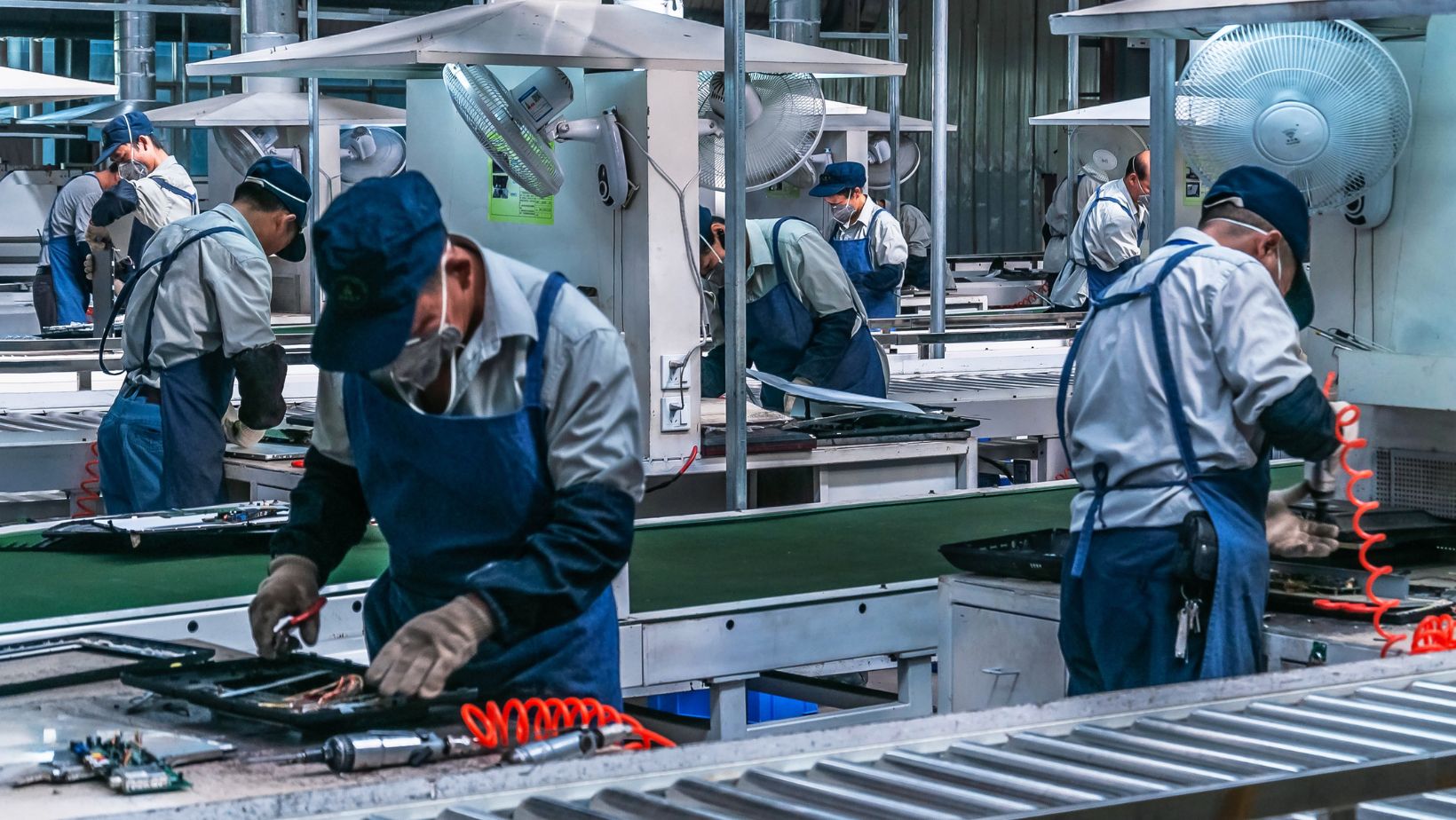
For bigger renovations requiring more specialized application, you should look to industrial powder coaters. Such professionals have more colors available and more application techniques under their belt. Even with outsourced work, knowing the color basics will help you specify your desires for a result that best reflects your aesthetic. They are wonderful partners when trying to match existing colors or work to a specific texture and finish that might just not be available to the DIY.
1. Consider the Project’s Purpose and Environment
The key determining factor when selecting a color must result from the intended use environment of your powder-coated item. Outdoor furniture faced with harsh sunlight and weather conditions might want to opt for lighter colors which reflect heat and don’t tend to fade much. High-traffic areas or items exposed to frequent handling may well be considered where darker colors or textured finishes can keep minor scuffs and dirt slightly hidden. For display pieces, it is all about your taste and the decor of the area.
2. Think About Longevity and Timelessness
While trendy colors may sell colors, it may also sell itself short for the aesthetic of your project in the long run. Powder coating, as a finish, is well recognized as an exterior application that is durable and made for years of service.
A powder coating application in a popular color could become formally outdated in just a few years, compelling a premature recoating to keep the project fashionable. Neutral colors, such as blacks, whites, grays, and browns, offer versatility and blend with almost any design style.
3. Consider Different Finishes and Textures
Powder coating, besides color, supplies various light and texture-related impacts to significantly change the appearance. For light, a glossy finish gives a sleek, flashy look, whereas a satin finish downplays glamor in favor of a more muted, contemporary feel. Texture finishes, such as wrinkle or hammer tone, can be visually interesting, provide good grip, and also hide imperfections on the surface below. Think about how the finish should correspond to the color you’ve picked and the feeling you’re going for.
4. Test the Samples in Different Light Settings
Colors behave differently when exposed to different light conditions. A sample looking just fine under a showroom’s bright fluorescent lights would appear somewhat different when exposed to the natural sunlight or the warm glow of the indoor lights. Obtain physical samples of your shortlisted colors and view them under different lighting conditions and at different times of the day to get a true idea of how they will look in the actual space in your home.
5. Consider Your Existing Color Palette
Consider other colors which already thrive in the space where the powder-coated item will be placed. Whether matching furniture, complementing wall colors, or contrasting architectural features, the color of the powder coat selected should bind the entire home’s color palette together.
6. Don’t Underestimate the Impact of Undertones
Colors come with undertones- slight harbingers of another color that tremendously affects its appearance. For instance, that gray could have hints of blue, green, or beige. Knowing the undertones within the color you choose serves a dual purpose-could make the other colors they are near complementary. Place samples beside something that already exists in your room to help you evaluate these undertones.
7. Utilize Online Visualizers and Physical Samples
Most powder coating suppliers or manufacturers provide online color visualizers that let you view colors on an object or two.
While these are extremely useful for preliminary research, always procure physical samples for true color judging.
8. Reflect on Size and Shape
The size and shape of an item being powder coated can alter the perception of a color. Larger surfaces tend to become very dominant through color while intricate details may respond favorably to particular colors or finishes. Take in all these factors when deciding.
9. Consider Practicality and Maintenance
Actually, rest some thought on the practicability of powders and color glazes you have in mind. Light colors show dirt as well as stains; darker colors, on the other hand, may absorb more heat especially in direct exposures to the sun. So, think of how you would manage to maintain these colors you have picked before making that final choice.
10. Take Risks-but Only Within Reason
Although choosing timeless colors is usually a good guide; however, don’t shy away from inserting bursts of color or more unusual hues if it fits with your style and project purpose. The purple powder coating is considered very durable, and one needs to appreciate the color they choose. For very large or permanently fixed works, just consider the ramifications of bold color choices for everyone involved.
By carefully analyzing these tips, powder coat color picking will put you on solid footing, with the right hues to uplift your home projects with durability, beauty and longevity that you will enjoy for countless years.
More Stories
6 Checks to Keep Your Backup Generator Safe and Ready
What the Shuffle Overview Reveals About Evolving Digital Experiences
Family Eligibility Under the Vanuatu Citizenship by Investment Program